Marketing
Papa Johns refreshes store design, marketing, logo

November 16, 2021
Papa Johns is debuting a company refresh that includes a logo, customer-centric restaurant design and brand visual identity, according to a company news release.
"The loyalty and love people have for Papa Johns has been built on our well-known promise of Better Ingredients. Better Pizza. — and today, we are signaling to the world that Papa Johns is 'Hungry for Better,'" Max Wetzel, Papa Johns' Chief Commercial Officer, said in the release. "We are evolving how the Papa Johns experience comes to life across all touchpoints, while remaining true to what got us where we are today and bringing to life our continued aspirations to improve and grow. This new experience is both a celebration of our tremendous momentum and a vision to inspire future growth."
Papa Johns is implementing a phased approach to roll out the experience to customers and team members.
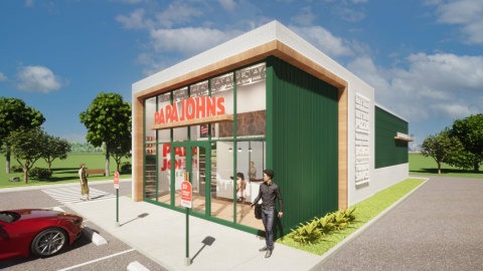
Papa Johns' streamlined, flexible environment will provide seamless purchasing and pick-up experiences for customers and empower Papa Johns team members to more efficiently prepare quality food. The open floorplan restaurant design blends modern simplicity with the warmth of the experience.
Papa Johns carefully crafted the restaurant design to provide its customers with better pick-up options in the drive-thru, at "Drive-Up Pick Up" and inside at the pick-up counter, which now includes a self-service option that allows customers to quickly grab their order without waiting in line.
In the kitchen, Papa Johns team members will prepare orders at modular stations that allow the same space to be used for different products at different times.
"Part of making it easier to say yes to Papa Johns development is having a smart and seamless design," Amanda Clark, Papa Johns' chief development officer, said in the release. "We worked with customers and our operations team to understand how we can have our stores be a true reflection of our brand while delivering an efficient operational experience, and this design delivers on that."
Papa Johns logo is a visual reflection of the new tone being set by the brand — bold, simple, fun and clean. This "Better by Design" logo features updated hues of Papa Johns signature red and green color crafted to better distinguish the brand wherever it is seen both online and in-person.
Papa Johns visual identity is brought to life through a variety of elements, including:
- Updated palette inspired by the company's premium ingredients that includes hues like tomato (red), basil (green), dough (off-white), garlic (light purple) and pickled pepperoncini (bright yellow-green) that provide bold pops and playful accents.
- A custom font inspired by the way Papa Johns fresh, never-frozen dough moves and stretches when team members craft pizza.
- Photos celebrating the best pizza moments — the ones shared with others — and showcasing the passion, pride and craft that goes into each of Papa Johns products.
- A "hand drawn happiness" illustration style that reflects Papa Johns vibrancy and the hand-crafted nature of its products will offer helpful information .
 ChatGPT
 Grok
Grok Perplexity
 Claude


